Bumble Headquarters
When Bumble designed their new headquarters in Austin, Texas, they knew they wanted the space to reflect the company’s unique mission and spirit. This meant specific, playful colors and trademark hexagon shapes that only Pratt + Larson could deliver.
Tile Dreams
Dubbed “The Hive,” it was important to Bumble that its new headquarters felt like home versus a traditional office space. They wanted to create a sense of community by reinforcing the Bumble brand around every corner – using its vibrant color palette, logo, and iconic hex patterns.
The space is really all about reflecting the themes of our brand: kindness, self-respect, fun, and a celebration of female empowerment. I wanted to make sure that the office had incredible energy and light at all times.
Whitney Wolfe, CEO
Bumble
JEI Design led this charge, and enlisted the help of the Architerra Showroom in Austin to make this dream a reality. With a variety of hexagon tile designs, Pratt + Larson worked to create this lifestyle-focused environment across three bathrooms and the employee break room.
When I heard ‘custom mosaics with custom colors,’ Pratt + Larson immediately came to mind. They’re our go-to for a huge color library, and they’re so great to work with.
Emily Andersen, Designer
Architerra Showroom
Enriching Spaces
Employee Break Room
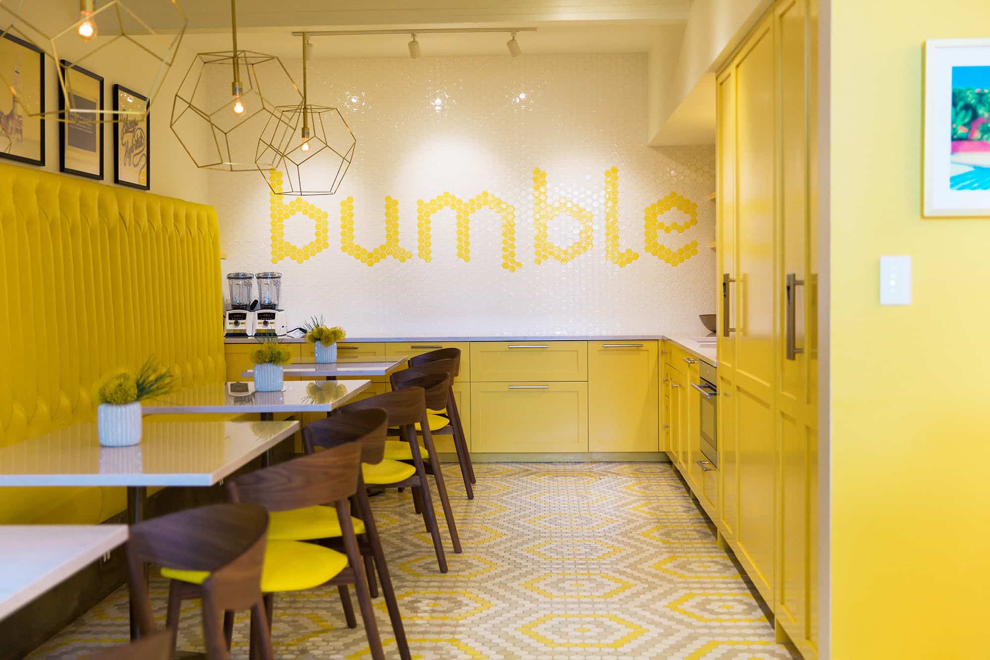
Of course, Bumble is an exceptionally team-focused company, so the employee breakroom was of particular importance. The team worked to create a space that would feel happy, kind, and welcoming – or, to quote Wolfe, “the true embodiment of a creative space.”
I think it’s really important to put your personal taste and touch on the places where you spend time, whether it’s personal or professional. It was very exciting to weave the brand quite literally onto the walls.
Whitney Wolfe, CEO
Bumble
This involved two major tile installations – the wall, where the letters “Bumble” are spelled out in a corporate typeface, and an intricate honeycomb pattern on the floor. For each, our 2” Hexagon Mosaic was selected in Bumble brand colors.
The concentric hexagons were a bit of a brain bender. The designer considered using a commodity tile company and then having the installer lay it out… but then you have so much less control over color and quality. Pratt + Larson went so far above and beyond to create a perfect stencil and label everything, so installation was quick and easy.
Emily Andersen, Designer
Architerra Showroom
Yellow Bathroom
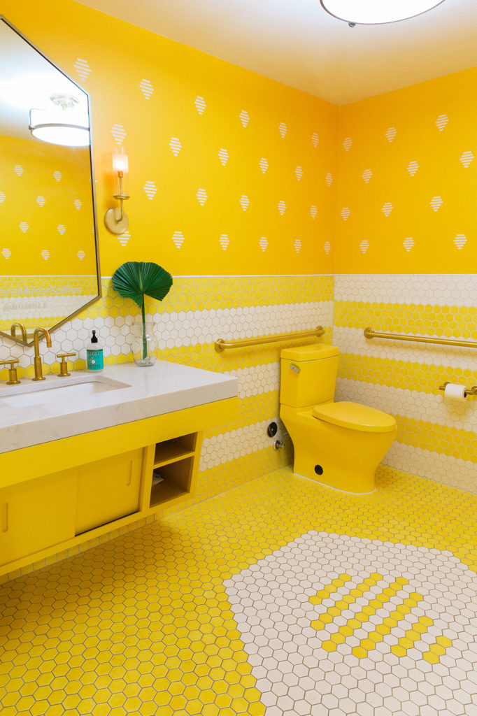
“We looked at every yellow under the sun,” says Wolfe. The first of three bathrooms at Bumble HQ reflects their trademark bumblebee hue on both the floor and striped wall patterns – both of which utilized our 2” Hexagon Mosaic.
The floor was a beehive, inside of a hexagon, made of hexagons. Geometry is hard, I don’t know how they got the spacing just right! But it turned out perfectly – especially the trim. Pratt + Larson has a mini corner round that a lot of tile vendors don’t have, and it’s a great way to finish off the mosaic.
Emily Andersen, Designer
Architerra Showroom
White Bathroom
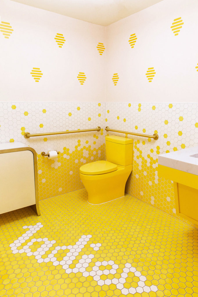
Another fun yellow and white pattern, this bathroom utilized hexagon tiles to spell out “ladies” on the floor, and to create a gradient mosaic up the wall – all in the brand’s signature color palette.
With commodity tile, the yellow was never quite right. Pratt + Larson sent a ton of samples, and we were able to find the perfect one (a shade they hadn’t used in 10 years). They sent it in sheets that made spacing really reliable – it was easy to pop out one tile at a time to keep the design consistent. Installation was a breeze.
Emily Andersen, Designer
Architerra Showroom
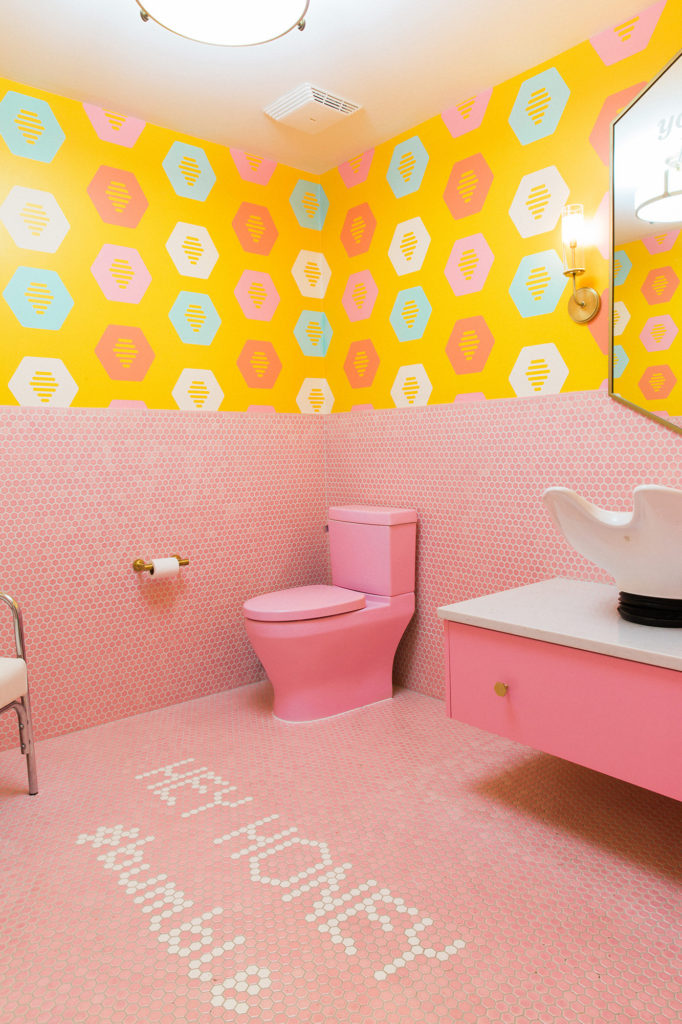
Pink Bathroom
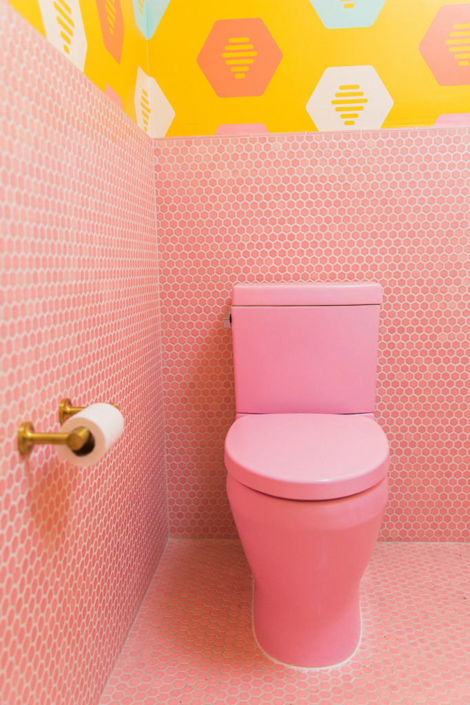
Representing the smallest tile used throughout the project, the pink bathroom was brought to life with our 1” Hexagon Mosaic and a custom pink gloss. With such a small tile size, color variation creates a sense of depth and motion that draws your eye around the room.
The pink was incredibly specific; we must have tested 12-13 samples. We gave Pratt + Larson a pantone color and they came really close. At the same time, we still wanted to keep the range of custom tile coloring so that you get some movement across the room. That’s a desirable feature, because otherwise where’s the interest?
Emily Andersen, Designer
Architerra Showroom
What all the buzz is about
The Bumble headquarters is a unique office space, to say the least, and the perfect homage to the beautiful Bumble brand. We’re proud that our vast color library can contribute to this energizing work environment.
Pratt + Larson is all about the people. Think about how many people actually touch the tile, as opposed to something factory-made that nobody cares about. They know so much, and they’re willing to bend over backwards for their art. That’s the difference. That’s what matters.
Emily Andersen, Designer
Architerra Showroom
JEI Design
JEI Design is an award-winning interior design firm lead by designer Julie Evans and built on a philosophy of creating stunning designs that speak “casual, formal, eclectic, individual.” Their work on the Bumble headquarters won “Best in Show” at the ASID 2018 Austin Design Excellence Awards.
