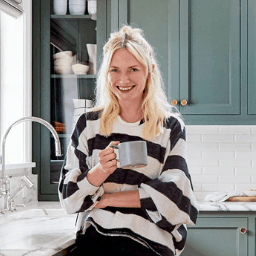
Emily Henderson Portland Home
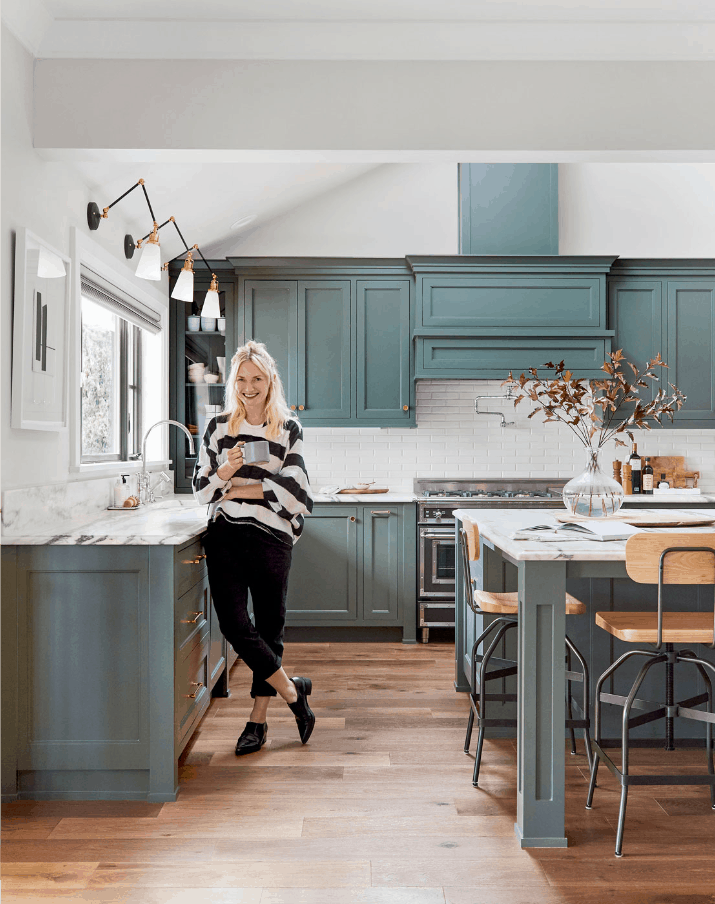
Interior designer Emily Henderson is known for conceiving masterful spaces. This mid-1980s Portland home “needed a complete re-haul and a big dose of soul,” so she called upon Pratt + Larson tile to help bring her design dreams to life.
Tile Dreams
The home is located in the Dunthorpe area of Portland, and so its renovation had to be timeless, classic, and worthy of a neighborhood filled with large, beautiful estates. Emily and her team had to strike a balance between creating something to resell, while remaining true to her unique style.
I took the crazy down a bit to make sure that anyone could see themselves here. Well, not anyone. Anyone who likes modern, classic style with a bit of casual glam. I didn’t want it to feel staged or have too much mass appeal. Mass appeal means generic, and this house just could not be generic.
Emily Henderson
Modern, classic style with a bit of casual glam? That has Pratt + Larson’s name all over it. Emily’s team spent nine months totally gut-renovating the property and infusing every square inch with character and soul, and we were excited to collaborate with her on tile in the kitchen, bathrooms, and a wet bar in the media room.
Enriching Spaces
Kitchen
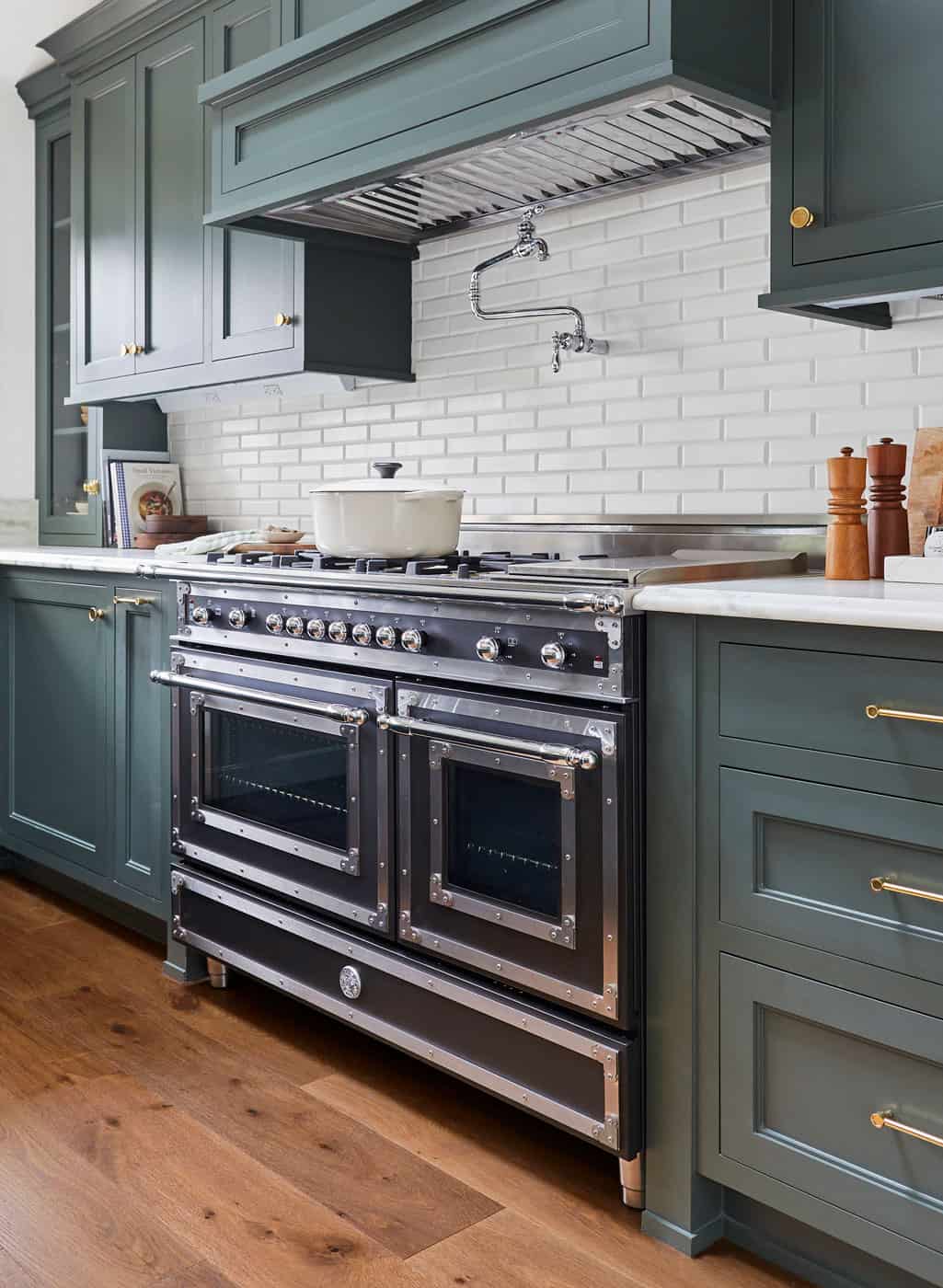
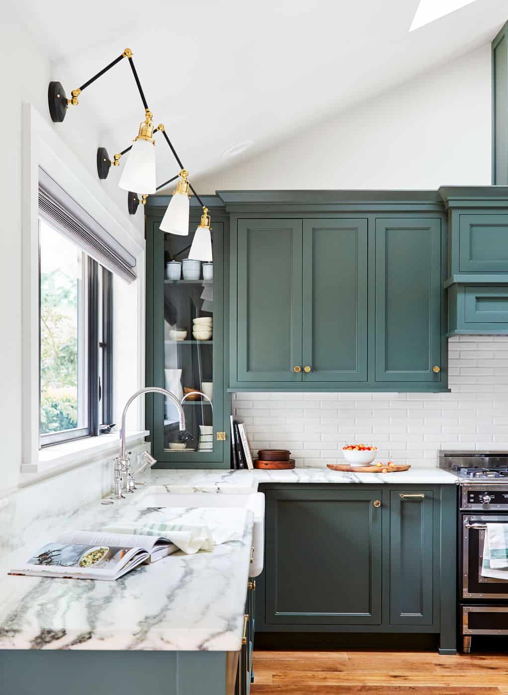
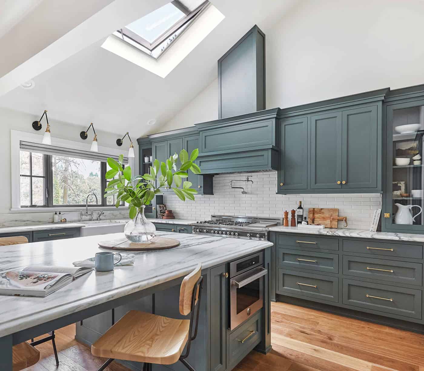
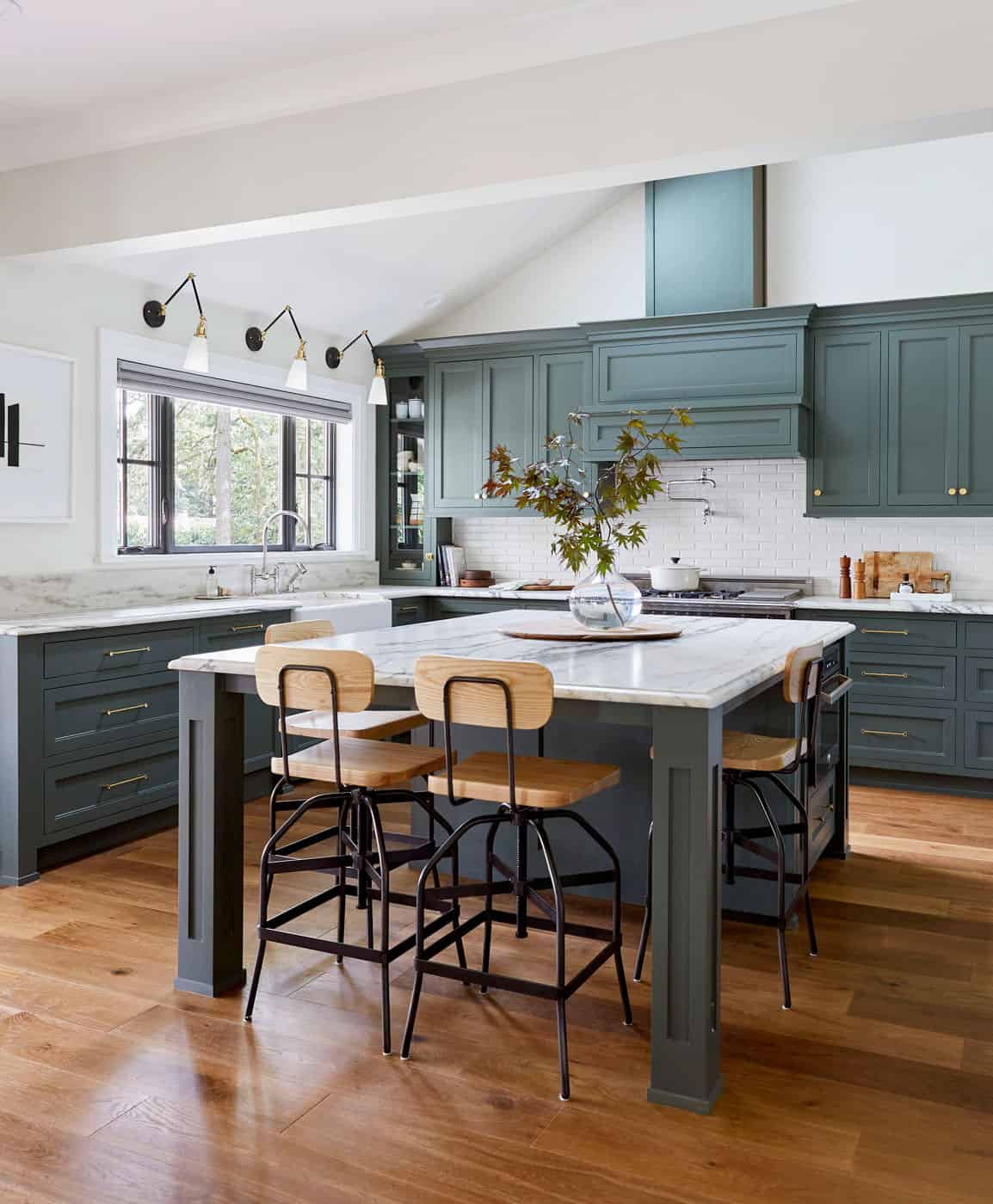
It’s common knowledge in real estate that kitchens sell houses. Which meant that as a flip, the kitchen in this house was of particular importance. Emily strived to create a beautiful, engaging space that she could see her own family enjoying.
I could have easily phoned it in with a basic kitchen, but I wanted it to be this perfect mix of classic + modern, happy + sophisticated, contemporary + timeless with enough special moments that take it from standard to special.”
Emily Henderson
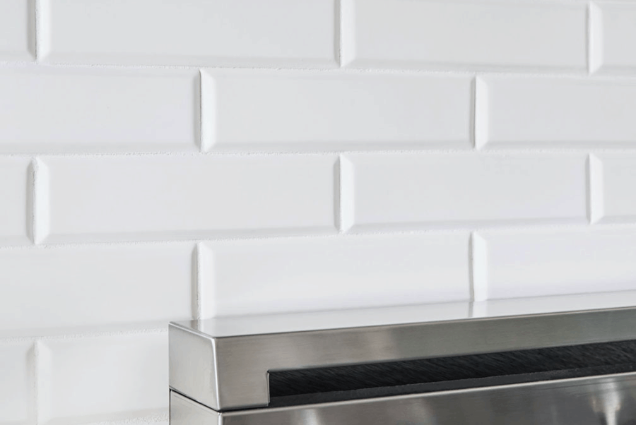
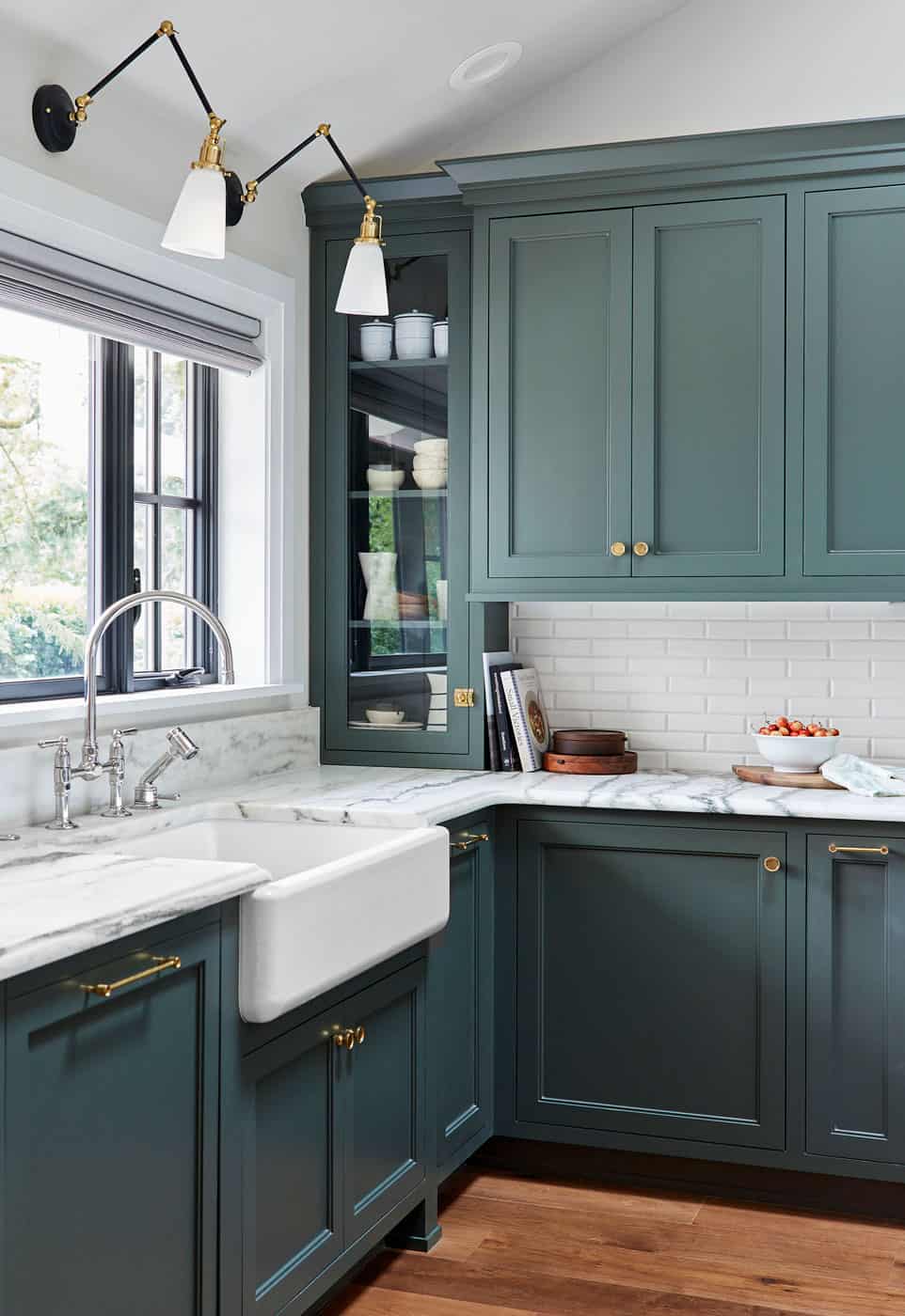
Emily chose our 2×8 Bevel for the kitchen backsplash – a nod to the classic 3×6 bevel but with a unique new dimension. The running bond placement creates a traditional look, while the matte finish brings a modern and fresh element.
The result is a Kitchen space that is bright, contemporary, and functional – and to quote Emily, “makes you want to jump into the computer when you see photos.”
Media Room Wet Bar
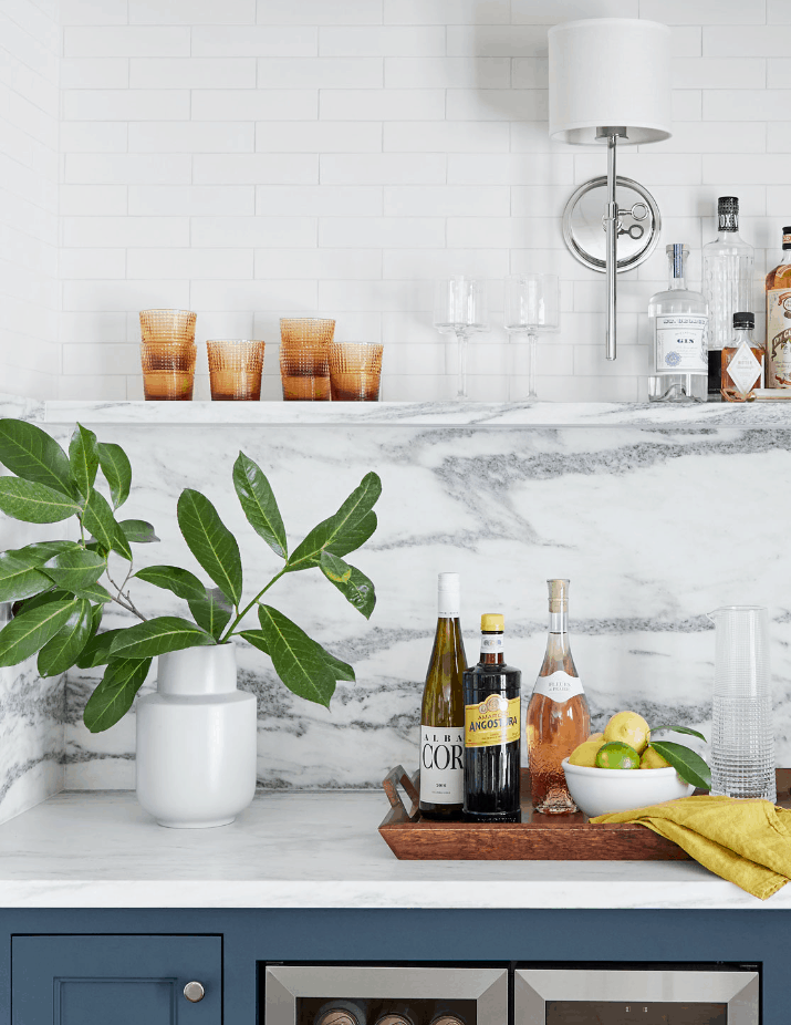
Located on the ground floor, Emily’s vision for the media room was “540 square feet of family fun.” This included a wet bar with a simple but beautiful tile wall.
We really wanted the vibe to feel casual yet sophisticated yet a little funky and special. Tall order, but I feel good about where we landed and how we got there.
Our Portland 2×8 tile was perfect for this because it added subtle texture while not feeling too busy – making the wet bar one of several eye-catching focal points in the room.
Hallway Bathroom
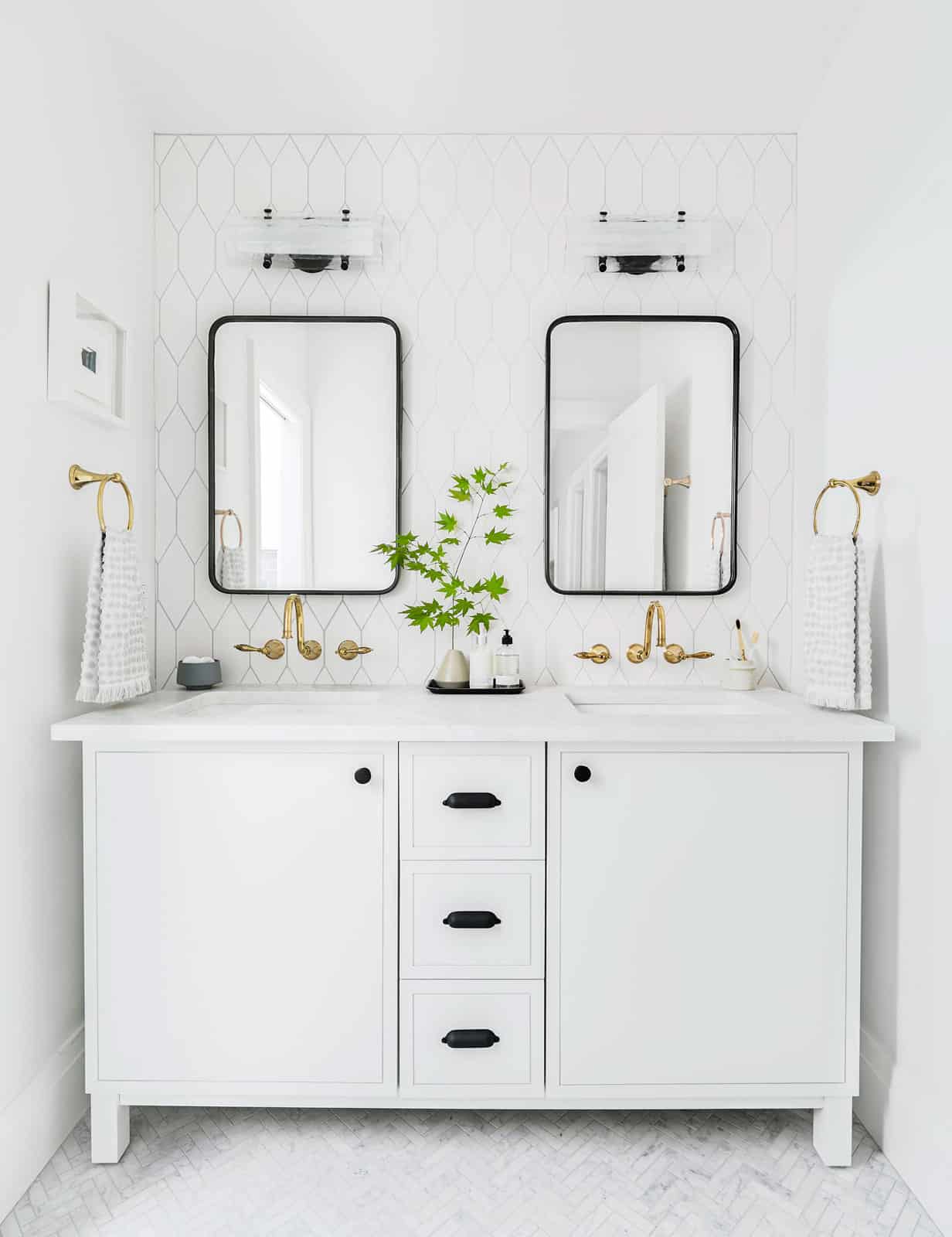
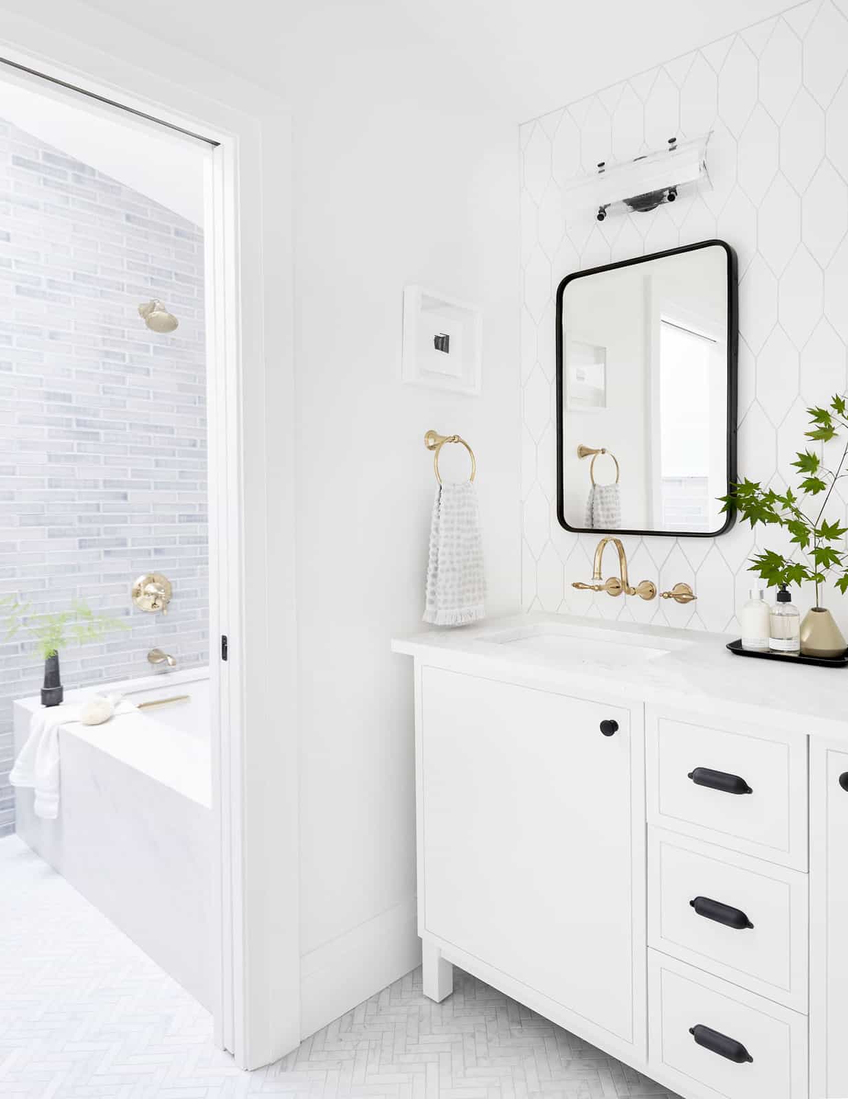
Since this is a hall bathroom that is shared with two bedrooms, Emily wanted the ability to separate the vanity and the showering area so that multiple people could use the space at once. This meant a tricky design challenge: since the two rooms are adjacent to each other and you can see one room from the next, she needed a way for materials and color schemes to work together, while still feeling unique and separate. She did this by leveraging tile to unify the space.
“I could have done something simple, basic, and neutral here in the name of “guest bathroom” but I’m SO glad we pushed the envelope just enough. Nothing here is some out-of-the-box funky/edgy design element, but taking a few chances like the tile shape/scale count resulted in a bathroom I’m incredibly happy with and love so, so much.”
This bathroom is a great example of the eclectic but unified look you can achieve by mixing different sizes, patterns, and finishes.
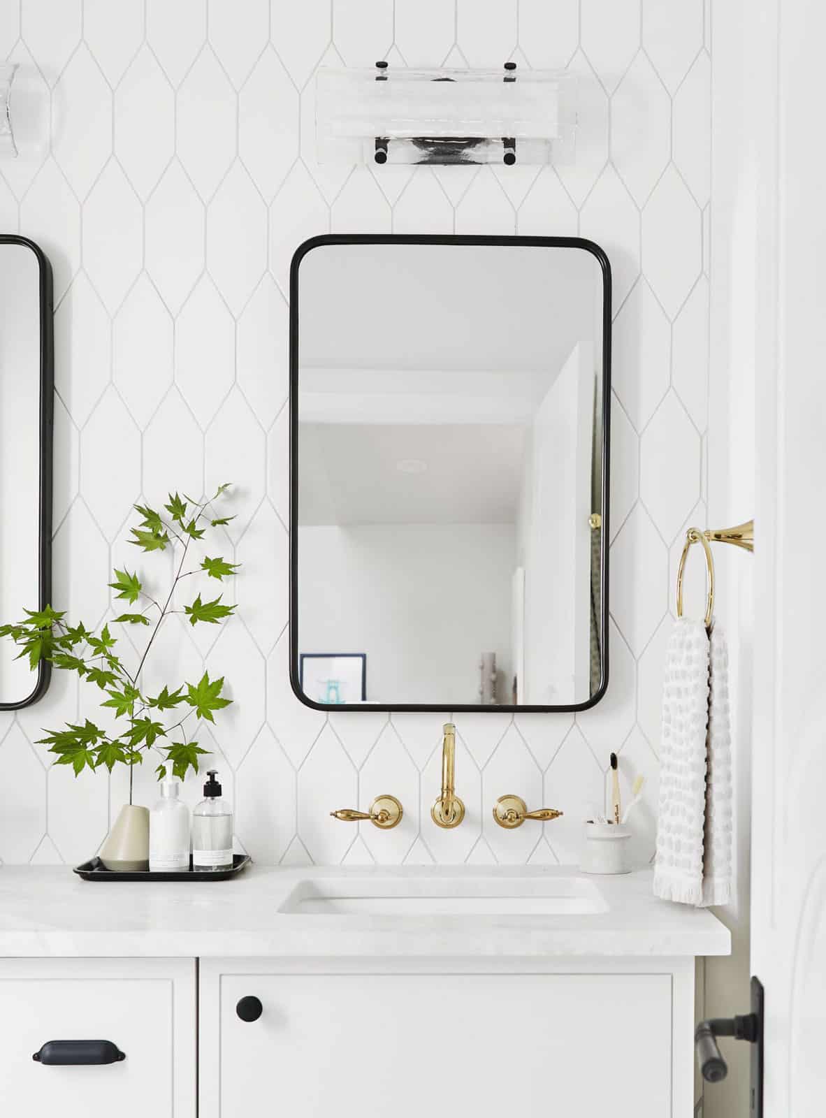
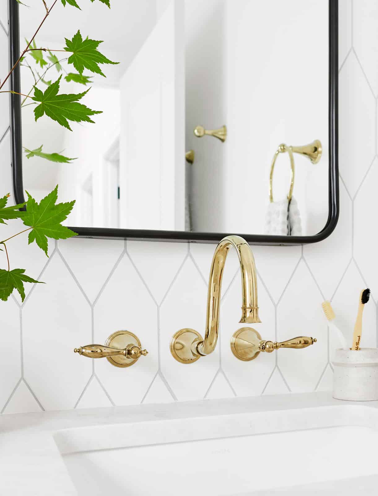
On the backsplash behind the vanity is our Large Picket tile. The scale of this smooth piece contrasts with the detailed texture of the tile in the shower room. Emily went with a grout color a little darker than the tile color to accentuate the shape of the picket tile.
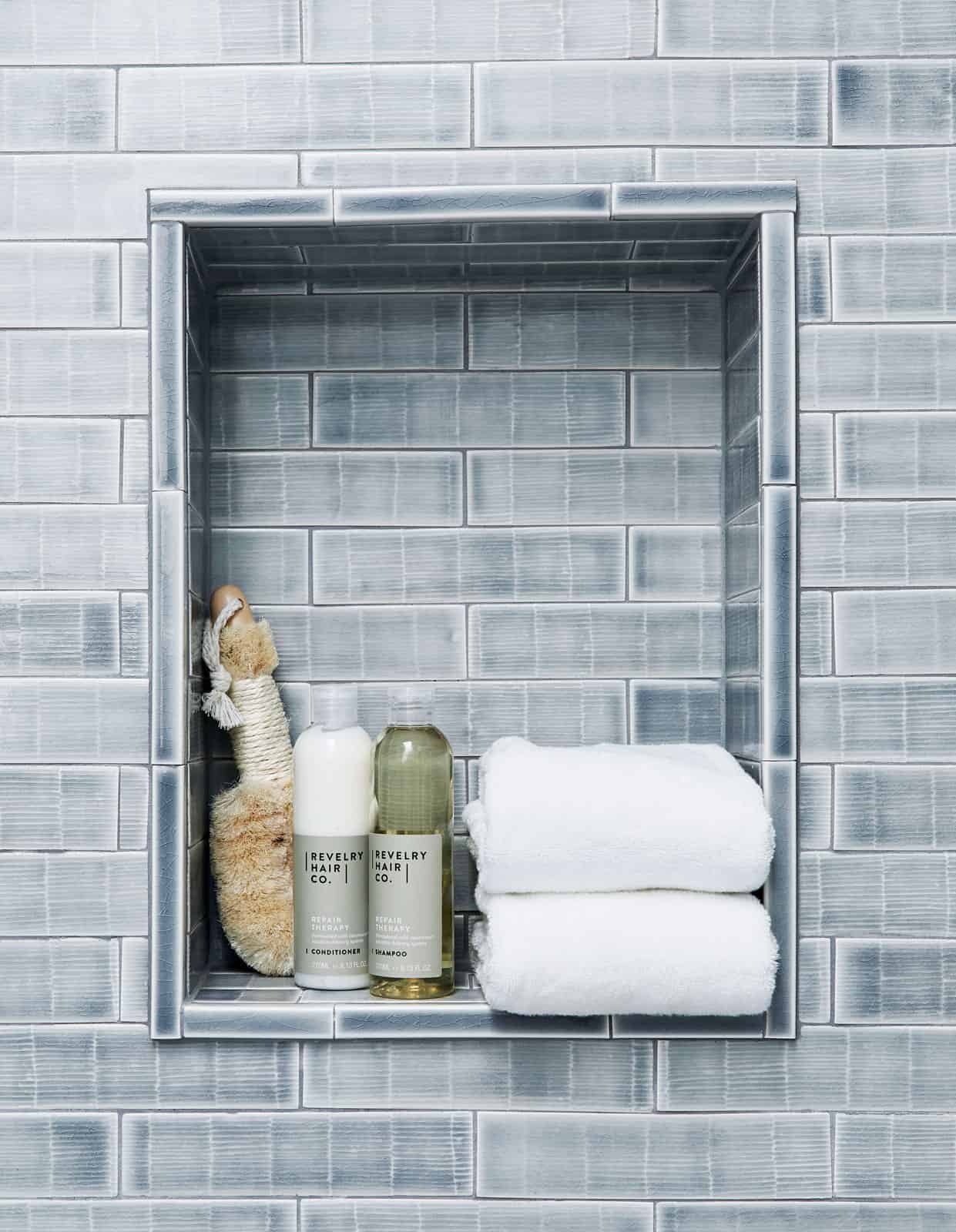
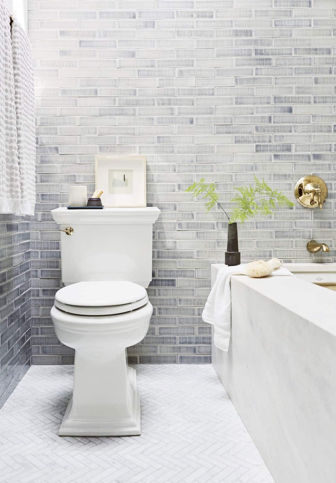
Our 2×8 field tile in Texture B is glazed in Watercolor W93, which allows the glaze to move and pool over the pattern – creating areas of light and dark that emphasize the texture and create beautiful variations.
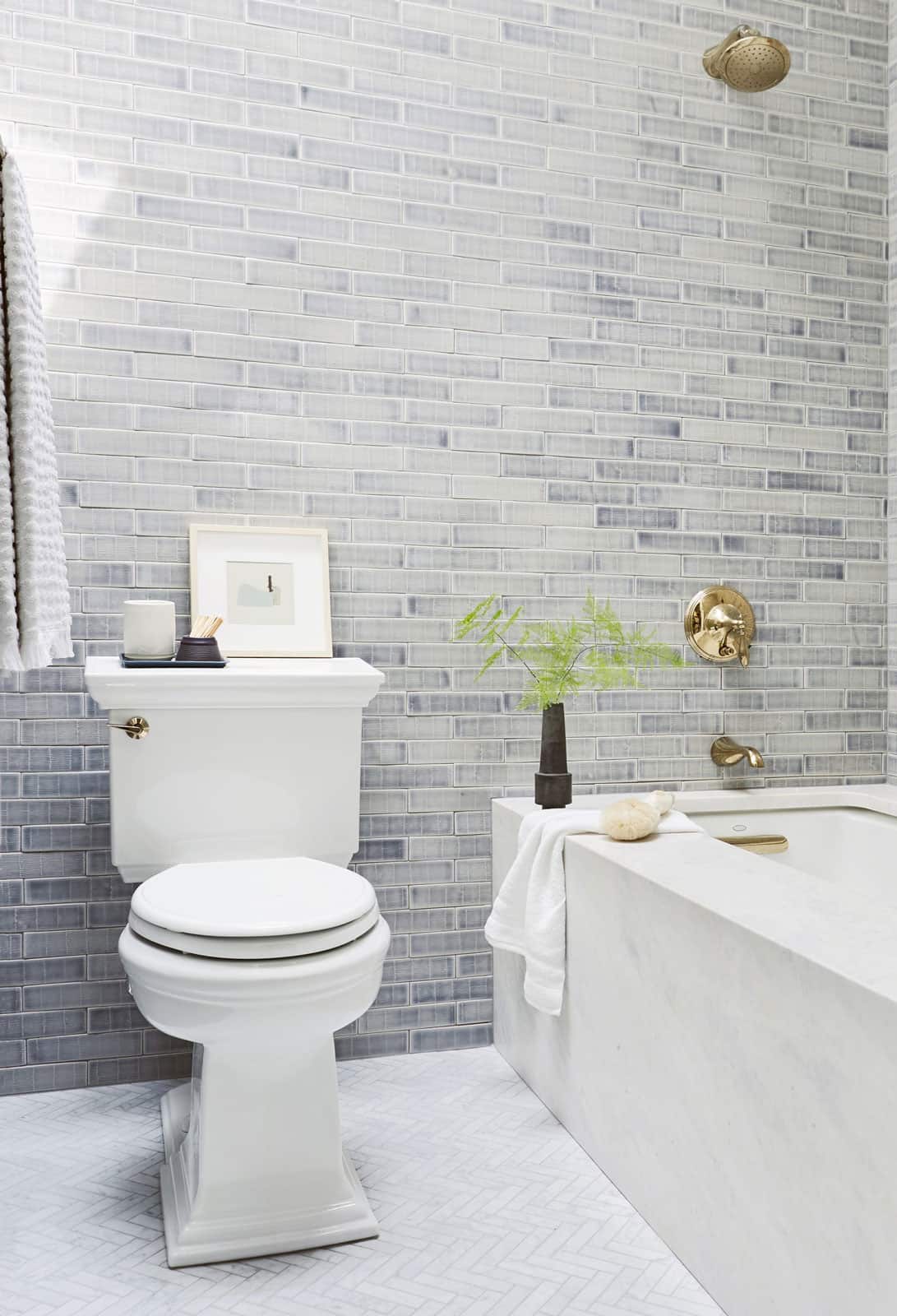
There is a lot of variety in the tones of the wall tile (more than we had predicted which scared me at first), but it turned out BEAUTIFUL.
The use of a marble mosaic herringbone on the floor of both rooms captures the angles of the picket and the gray tones of the textured field and ties them all together beautifully. The result is a gorgeous, unified space that draws your eye easily from one room to the next.
Guest Bathroom
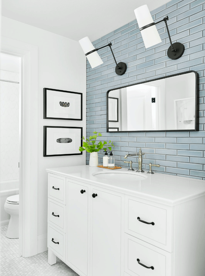
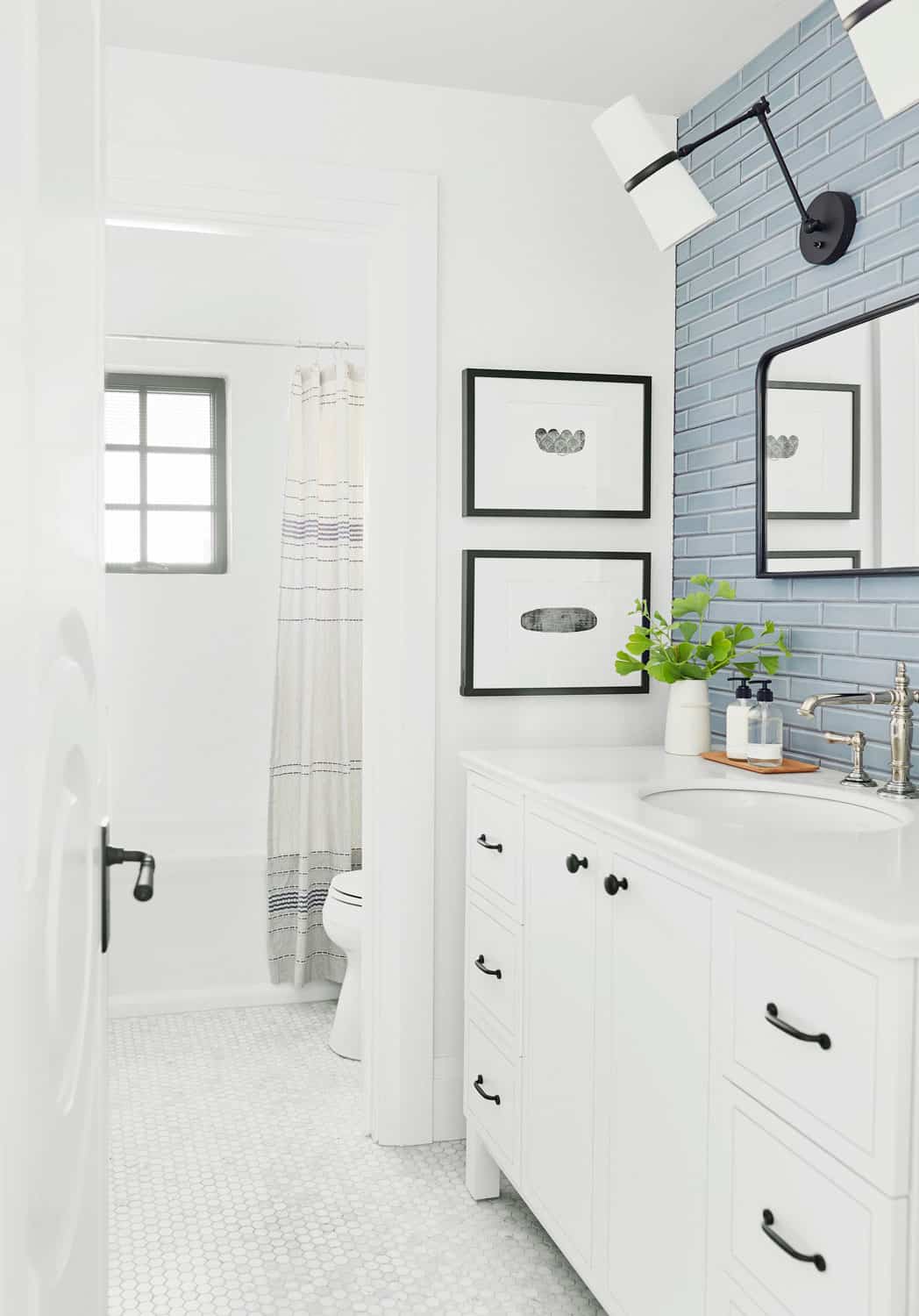
The guest bathroom has only a small window, making it the darkest bathroom in the house. So, Emily’s goal was to make it feel as light and bright and happy as possible. She brought in two sets of tile – one for the vanity and one for the shower surround – to achieve this look.
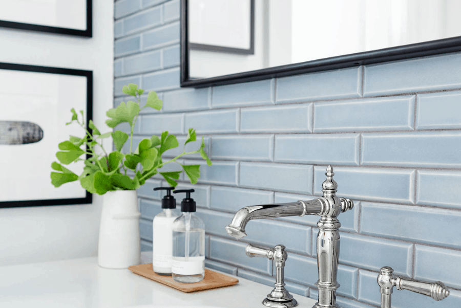
The vanity room needed some life and a white subway wasn’t going to cut it, but I didn’t want to do a crazy bold statement tile or mosaic or anything. So, we chose this handmade blue-ish gray tile. In the matte finish, you can see the variation in tones and colors which makes it feel so custom and handmade, and we grouted it with a darker grout to make sure that you see the bevel.
The blue 2×8 bevel tile is finished with our parchment matte glaze P146. The shape of the bevel keeps it contemporary, and ties it to the tile in the kitchen. This recurring element helps the house feel cohesive, a trademark design technique.
The toilet/tub room is pretty tight, so we did it in a white tile that is soooo pretty. I’m OBSESSED with it. We grouted it in a light gray so that you could still see the pattern, without making it too busy.
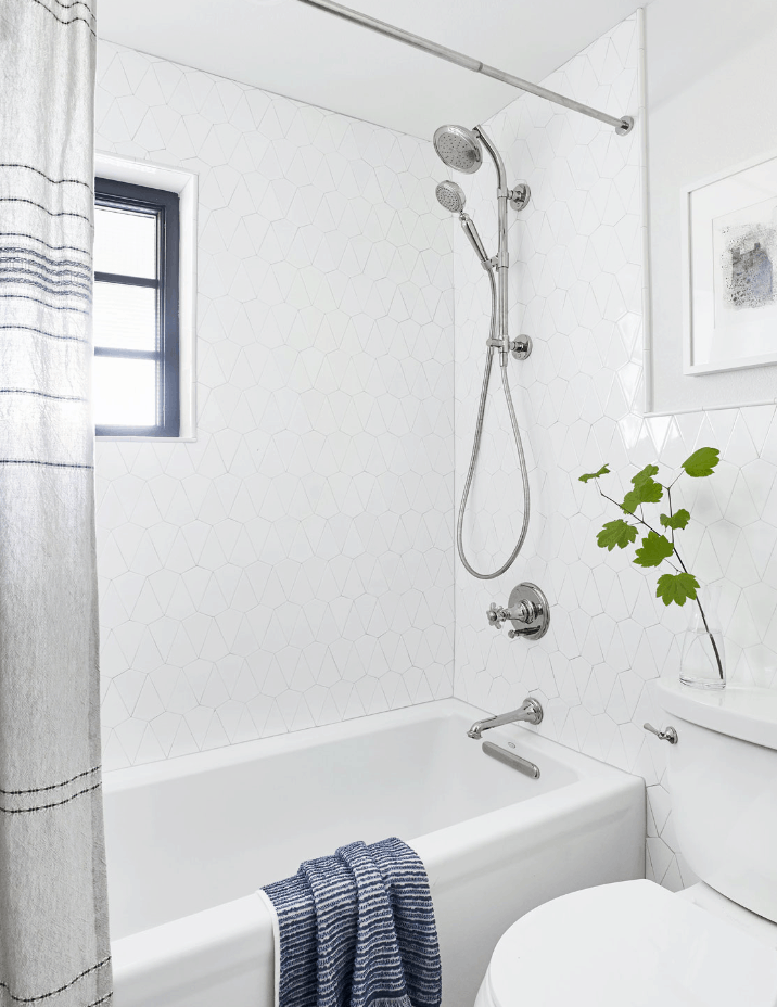
The shower surround is our Facet tile. Emily’s use of white grout here make the shape of the tile recede and creates a quiet statement that’s a nice surprise once you notice it.
All in all, the bathroom is bright and airy, with interesting colors and textures to draw the eye.
From fixer-upper to true luxury
Emily’s expert use of Pratt + Larson tile creates exciting room-making moments throughout the house. The design is perfect for this woodsy estate, and proof of Emily’s overall design philosophy: “To get a custom look in any room, you HAVE to shake it up and take some risks.”
Emily Henderson
Emily is a stylist, author, and TV host with a vintage-inspired approachable home style. Why does she love Pratt + Larson tile? “They are handmade in Portland by people who have worked there for 30 years because they love it so much, and they take so much care and create each tile with such artistry.”
