Jessica Helgerson Albermarle Terrace Home
Jessica Helgerson’s approach to interior design is dynamic and thorough. This 1920s Portland home needed a complete reconfiguring of the layout – creating an opportunity to select all new finishes, fixtures, and furniture. Pratt + Larson’s expansive glaze palette and custom color capabilities allowed for tile selections perfectly in tune with the overall design and the client’s desires.

Tile Dreams
This project was a top to bottom remodel of a 1920s house in Portland’s Northwest Hills. The goal was to create a new character for the house that felt in keeping with the vintage, while making it comfortable and welcoming for her clients, a young family of four.
It was an older house, but it didn’t have a lot of the amazing detail you usually see in early 20th century homes. That gave us the opportunity to give it some character and imagine what it could have looked like. How can we design details that feel like they’ve always been there – while still feeling fresh, bright, and appropriate for a modern family?
Alisha Borden, Senior Designer
Jessica Helgerson Interior Design
Bringing together vintage style with a modern edge is Pratt + Larson’s specialty. We were excited to collaborate with Jessica on the kitchen, butler’s pantry, and downstairs bath.
Enriching Spaces
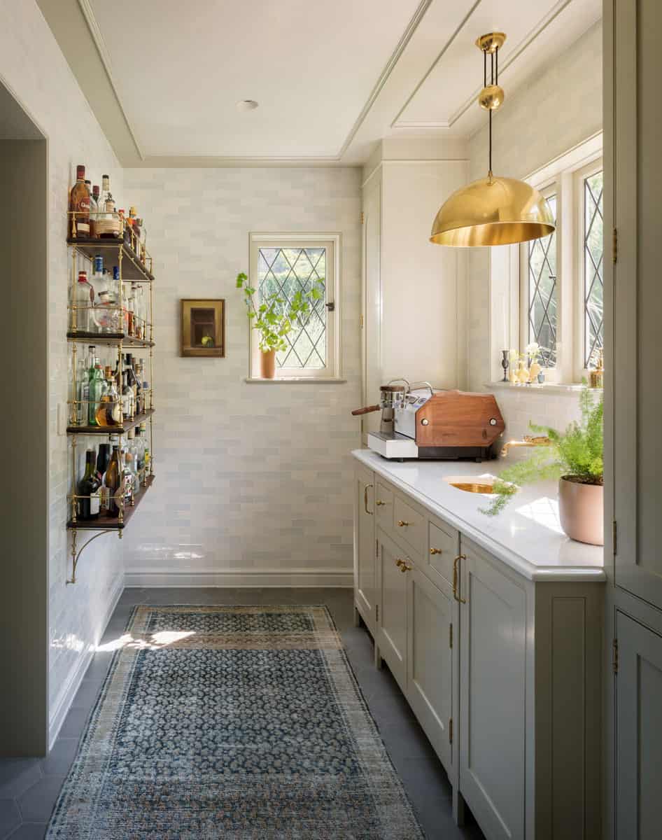
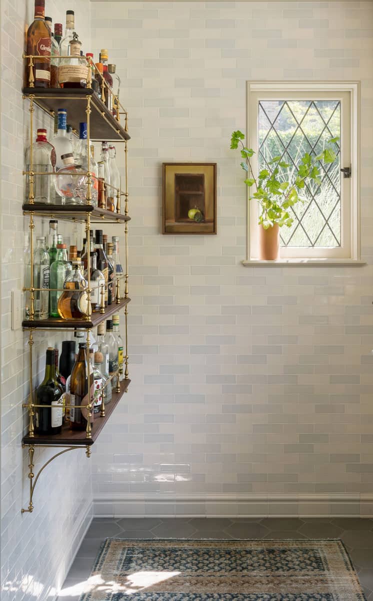
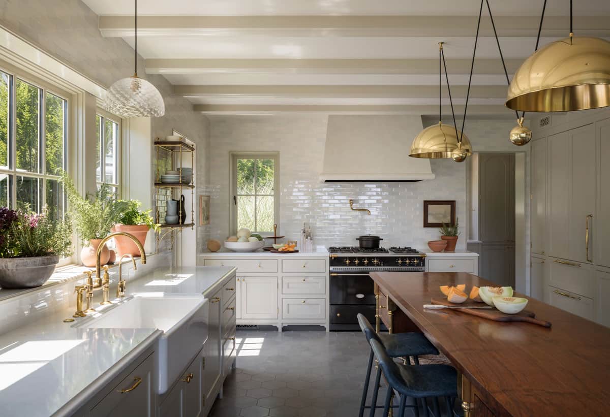
Kitchen & Butler Pantry

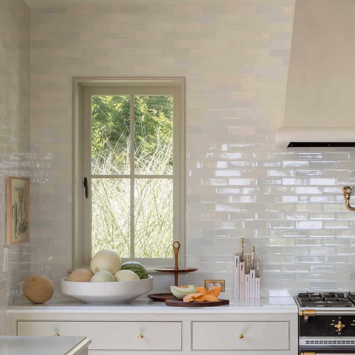
As one of the busiest and most-loved spots in the home, the kitchen deserves particular attention – and this one couldn’t be more idyllic. The homeowners wanted something light, warm, and friendly, and so soft wall colors were a must. Jessica and her team chose our 2×6 Portland field tile for the walls in the kitchen and the butler’s pantry.
Because of the amount of windows above the benchtops, there was very little space to incorporate a special backsplash without it being constantly interrupted. The solution was to run the tiles to the ceiling and use them across all the kitchen walls.
Jessica Helgerson
The JHID design team wanted to emphasize the rich variation already in our glazes, and asked us to create a palette of three custom colors. These were blended in a random pattern, creating subtle variety and a soft visual texture without getting too busy – even when used throughout the entire kitchen.
We knew we wanted to work with Pratt + Larson because of their custom trim and color capabilities. They helped us come up with three warm gray colors, and we did equal percentages of each one to push the variation and make it look natural (not like a pattern). The Portland field surface gave them a different look, with the added benefit of being wiped down easily – which is crucial with young kids.
Alisha Borden, Senior Designer
Jessica Helgerson Interior Design
The result is a kitchen space that is bright, contemporary, and superbly functional. The wall tile combined with other thoughtfully considered elements create a truly classic, livable, and warm space that will be enjoyed for years to come.
Although finishes like the wall tile are muted, it works because of the variety of subtle undertones. All the elements work in tandem, balancing each other to create a palette filled with warmth and layers of visual interest.
Jessica Helgerson
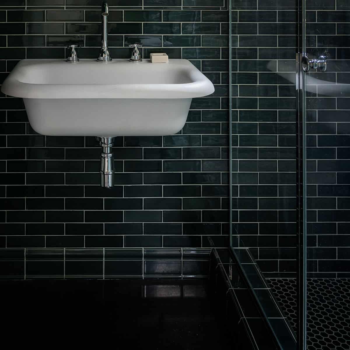
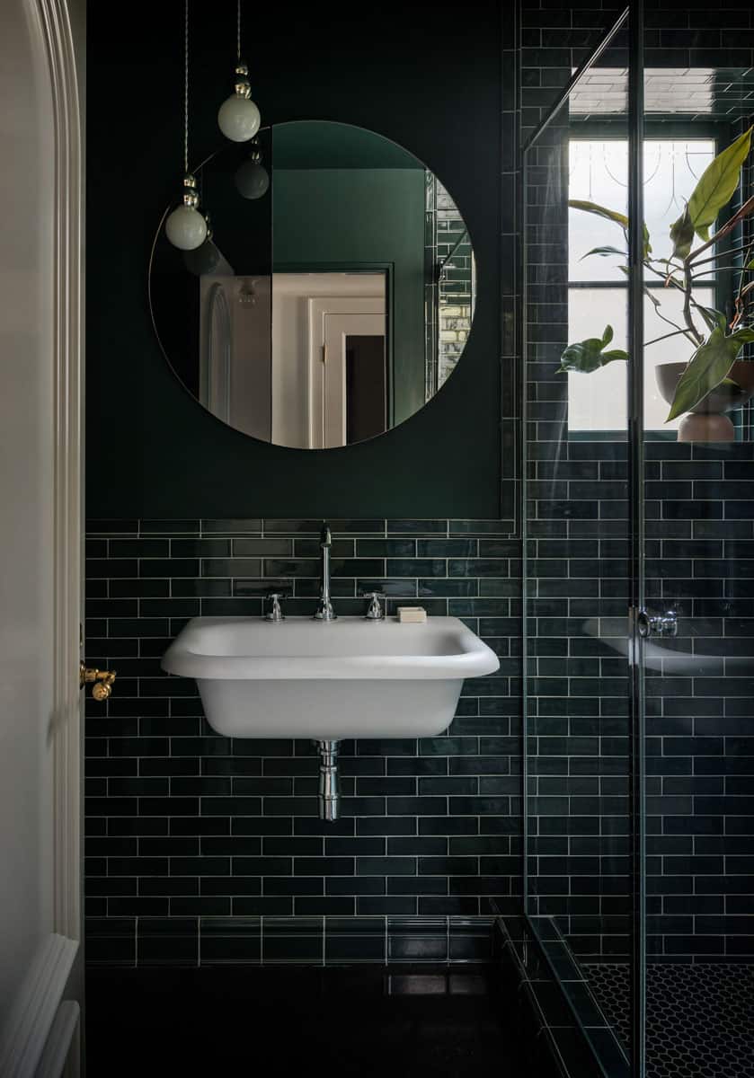
Sauna Bathroom

If a room is naturally pretty dark, I think you can lean into that. Why fight it? It won’t be sunny anyway, so let it be sultry!Our recently developed watercolor glaze, W98, was the perfect fit for this subterranean oasis. An example of Pratt + Larson’s continued color experimentation, this deep jade was hot off the presses when it caught the eye of senior designer Alisha Borden.Jessica Helgerson
Someone from Pratt + Larson dropped off a sample board with a new color that had been developed for another project – and I just loved it. A bold color like that can be a little scary with hard materials, but embracing it was really rewarding. We even ended up using a close color match paint for a fun tone-on-tone look.And this boldness paid off – creating one of the most intriguing focal points of the home and giving the entire bottom floor a truly elegant feel.Alisha Borden, Senior Designer
Jessica Helgerson Interior Design
Vintage soul with modern practicality
Having trusted vendors makes my job so much easier. We always spec the best material for the project, but it’s a blessing when they can come from the same place. Pratt + Larson has been so amenable and accommodating, and what they do is so unique. From specialty colors, to custom trim and corner pieces – you can’t order that kind of thing from a catalog.Alisha Borden, Senior Designer
Jessica Helgerson Interior Design

Jessica Helgerson
Jessica’s work is inspired by the natural elements that surround her, which you clearly see reflected through the textures, materials, and colors of her work. She takes her partnerships seriously: “Our network of collaborating professionals, formed through fifteen years of practice, includes architects, builders, artists, and artisans who share our vision.”